A quick exploration of global energy data, with a focus on visualizing the scale of the energy transition and the displacement hypothesis. As more renewable energy sources are integrated into the grid, are we replacing existing fossil fuel generation or simply meeting a growing demand?
These plots were made using Python visualization libraries, including MatPlotLib and Seaborn, with data sourced from the International Energy Agency and Our World in Data. The goal was to create clear, informative visualizations that highlight key global energy trends.
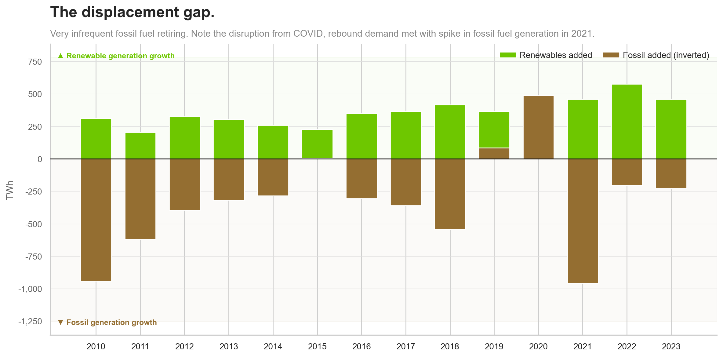
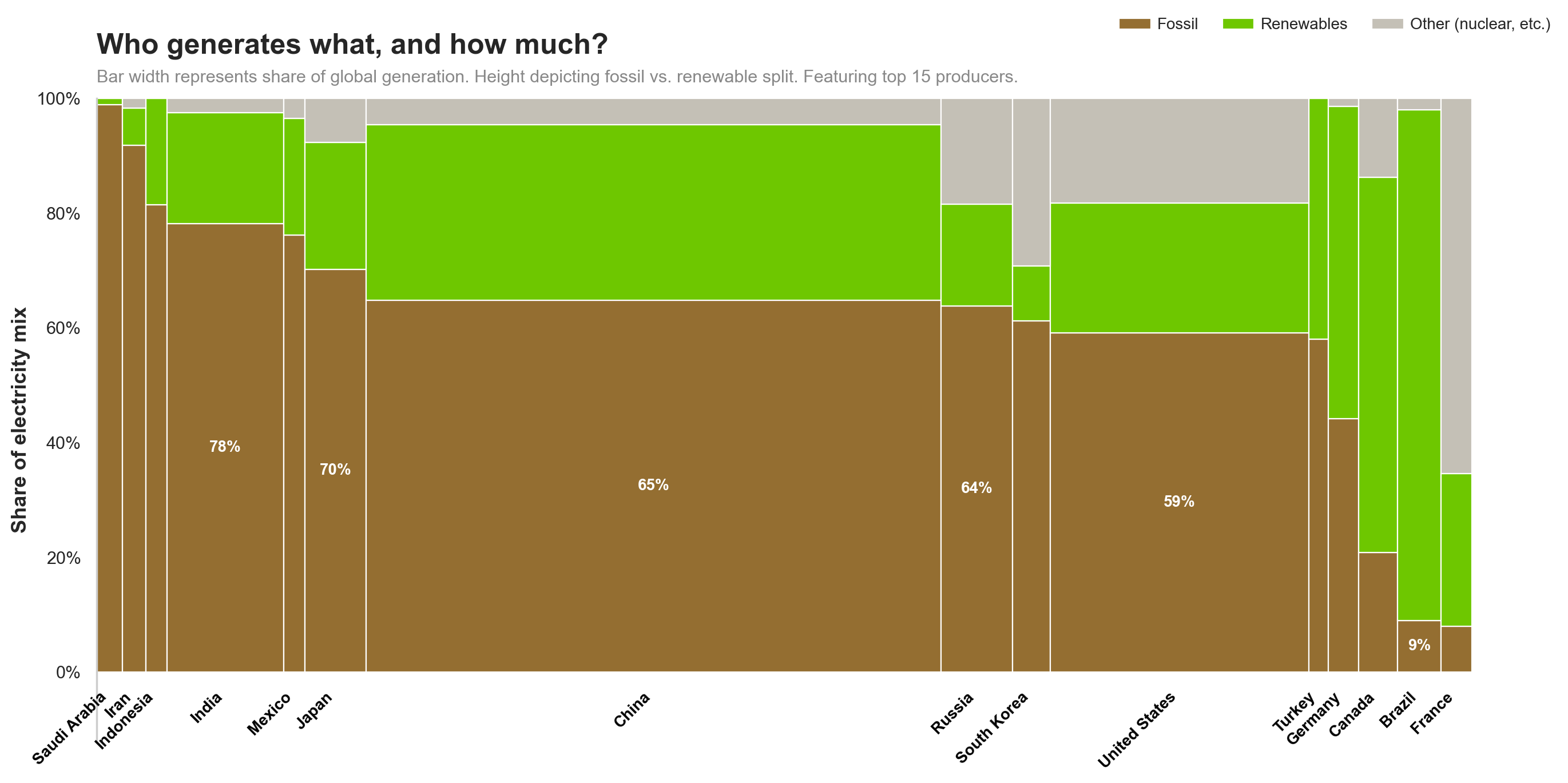
Fig. 1 tests the displacment hypothesis. As renewable energy scales, does fossil fuel energy production reduce proportionally? This question is complicated by implications of COVID-19 on global energy use. Fig. 2 shows a marimekko-style chart visualizing the distribution of different energy sources across various countries in 2023. Focus is on visual area, or the actual amount of energy produced and thus the impact of the country's energy mix on the world. We can see that the countries with the "best" mix of renewable vs fossil fuels have a smaller potential for global change.
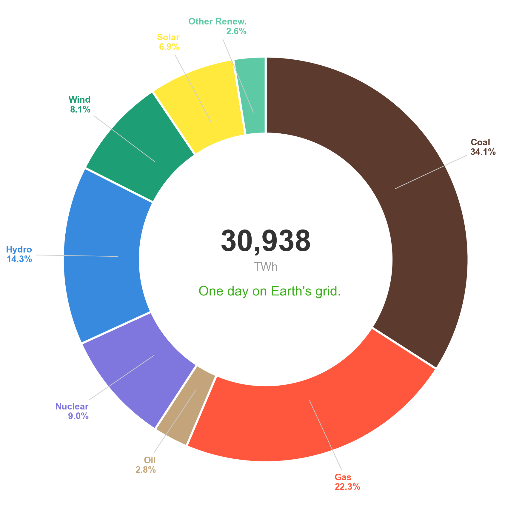
Fig. 3 displays a donut chart representing the global energy mix in 2023, highlighting the proportion of different energy sources contributing to the overall energy production.